Broken on Purpose: How Gen Z Designers Turned Visual Chaos Into a Cultural Statement
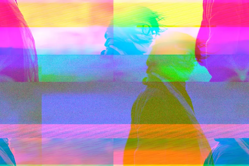
There's a poster making the rounds on design Twitter that looks, at first glance, like your laptop is having a stroke. The typography is smeared. The color palette looks like a JPEG that got left in the sun too long. Pixel artifacts bleed across the layout like digital bruises. And the designer who made it? Absolutely thriving.
Meet the glitch generation—a loose but unmistakable cohort of designers, illustrators, and digital artists in their late teens and twenties who are treating visual imperfection not as a mistake to fix, but as the whole point. Their work is showing up everywhere: TikTok thumbnails, indie band merch, zine covers, brand identity packages for small businesses that actively don't want to look like they hired a corporate agency. It's chaotic. It's intentional. And it's quietly rewriting what "good design" is even supposed to mean.
The Anti-Portfolio Aesthetic
For decades, design culture operated on a pretty clear hierarchy. Clean meant professional. Minimal meant sophisticated. Polish meant you knew what you were doing. The Swiss grid system, the Bauhaus legacy, the long shadow of Apple's aesthetic dominance—all of it pushed the field toward a kind of visual perfectionism that treated any sign of friction or noise as failure.
Gen Z designers grew up inside that world and, largely, rejected it.
"I was in school being told to kern tighter and align everything to the pixel, and I just kept thinking—why does everything have to feel like a software UI?" says Dani Rowe, a 23-year-old graphic designer based in Portland who builds much of her client work around what she calls "intentional entropy." "There's something really dishonest about that level of control. Real life doesn't look like that. Real emotion doesn't look like that."
Rowe's portfolio reads like a fever dream: overlapping scan lines, deliberately misregistered color separations, type that seems to be actively escaping the layout. She has a waitlist.
This isn't a niche phenomenon. Scroll through design communities on TikTok—hashtags like #brutalistdesign, #glitchaesthetic, and #noisydesign collectively pull hundreds of millions of views—and you'll find a sprawling, self-taught generation trading techniques for how to make things look more broken, more raw, more real. Dithering filters. Halftone abuse. Deliberately low-res textures layered over modern photography. The tools of imperfection have become a shared vocabulary.
Authenticity as a Design Requirement
To understand why this is happening, you have to understand the cultural moment these designers came up in. They are the first generation to have grown up entirely inside the attention economy—chronically online, algorithmically sorted, surrounded by content that has been A/B tested, optimized, and smoothed into frictionless engagement bait.
And they're exhausted by it.
"Everything that's designed to perform well on the algorithm looks the same," says Marcus Tello, a 21-year-old illustrator and designer from Chicago who runs a small print shop out of his apartment. "The same fonts, the same color gradients, the same composition tricks. When everything is optimized, nothing feels real. Glitch and noise are the opposite of optimization—they're proof that a human being actually touched something."
This is the deeper philosophical engine running underneath the aesthetic. Imperfection has become a signal of authenticity in a media landscape where authenticity is both desperately craved and systematically manufactured. A smudged ink texture, a corrupted font, a layout that looks like it was assembled in a hurry on someone's bedroom floor—these are visual cues that say a person made this, not an algorithm, not a template, not a brand consultant with a 40-slide deck.
That's a genuinely radical statement in 2024.
Ugly Is Doing a Lot of Work Right Now
What makes this movement interesting—and what separates it from pure nostalgia or retro pastiche—is how politically charged some of it feels. A lot of the designers working in this space are explicit about what they're pushing back against.
The hyper-polished aesthetic that dominated the 2010s wasn't just a design trend; it was tied to a specific cultural moment of tech optimism, startup culture, and the idea that everything could be disrupted into something cleaner and better. Sans-serif fonts and flat design were the visual language of that worldview. Rejecting that aesthetic, for many young designers, is also rejecting the ideology underneath it.
"There's a version of clean design that is fundamentally about control," says Yara Osei, a 24-year-old designer and design educator based in Brooklyn who teaches workshops on what she calls "anti-corporate visual culture." "It's about making things legible to power—to brands, to investors, to systems. Noise and chaos are harder to commodify. That's part of why I like them."
Osei's workshops, which she runs out of a community arts space in Bed-Stuy, are consistently overbooked. Her students range from fellow designers to activists to small business owners who want their visual identity to feel like it belongs to them, not to a market trend.
The Establishment Is Catching Up (Awkwardly)
Of course, the moment any underground aesthetic starts generating real cultural traction, the brands come sniffing around. And sure enough, you can already see watered-down versions of glitch aesthetics showing up in major advertising campaigns, corporate social media accounts, and—somewhat painfully—in the rebranding efforts of companies trying to seem more "authentic" to younger consumers.
The designers who originated this language have complicated feelings about that.
"When a bank uses a glitch filter in their Instagram post, it's not the same thing," says Rowe. "It's the visual equivalent of a corporation saying 'we're not like other corporations.' It's just another optimization strategy wearing a distressed jacket."
The tension is real and probably unresolvable. Subcultures get absorbed. Aesthetics get commodified. That's the oldest story in art history. But what's notable is how quickly this generation recognizes and articulates the co-optation when it happens—and how deliberately many of them are trying to stay one step ahead of it.
Tello puts it plainly: "Every time something goes mainstream, we just go weirder. There's always somewhere further out to go."
What Comes Next
It would be easy to dismiss all of this as a phase—a generational contrarianism that will eventually mature into something more legible and, yes, more polished. Design history is full of rebellions that got smoothed out over time.
But there's something different happening here that feels worth taking seriously. This isn't just a stylistic preference. It's a coherent response to a specific cultural condition—the anxiety of living inside systems that feel simultaneously inescapable and deeply untrustworthy. The glitch is a way of making that anxiety visible. Of insisting that the cracks in the surface are actually the most honest part of the picture.
In a design culture that spent years telling young people that the goal was to make everything invisible and frictionless, a generation decided that friction was exactly what they wanted to feel.
That's not immaturity. That's a point of view.
And honestly? It's making some of the most interesting visual work happening right now.